The brief
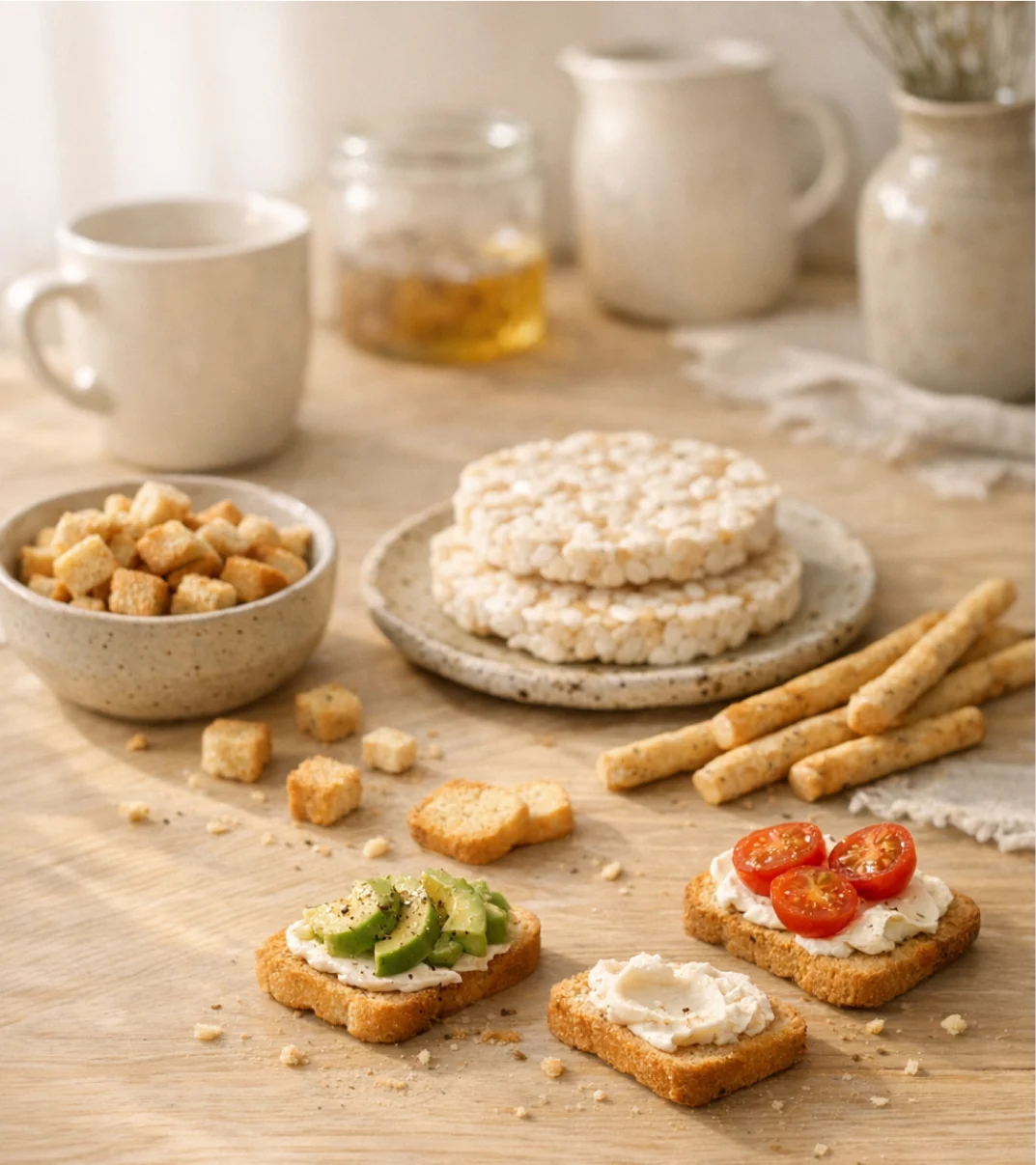
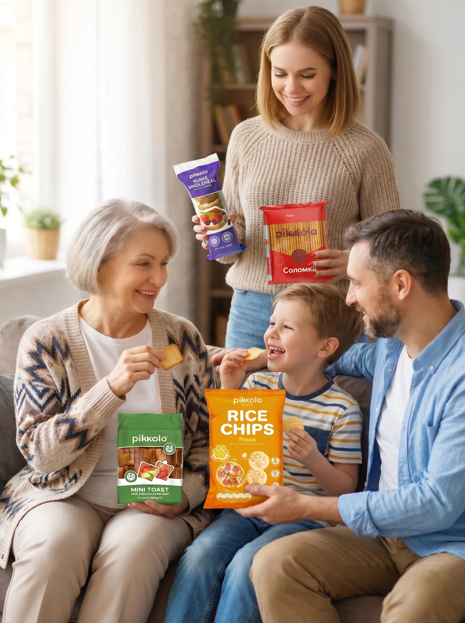
Pikolo makes rice chips, rusks, breadsticks and other crispy snacks for everyday moments. The products were loved, but the brand had no brand book: every pack, post and ad was designed from scratch, and the brand looked different everywhere.
My main task was to create a brand character who would live on the packaging and speak for the brand. Together with the team, I also collected the brand’s fonts, colours and packaging rules into one system — Pikolo’s first brand book.
Full brand book available on request — let’s talk
The crunch
expert
Before drawing anything, we defined who Pikolo is: crispy Ukrainian snacks for every moment — simple, tasty and honest. Warm, never preachy.
Reliable
Stable, trusted and time-tested.
Lively
Emotional, joyful, full of small crunchy moments.
Accessible
Fair price, clear choice, no complexity.
Homely
Warm and close, with the feeling of home comfort.
Local
Ukrainian roots, cultural code and local production.
Friendly, warm and sincere — like a talk with a good friend.
“We create a wide range of healthy and tasty snacks that help people make any moment of life easier, healthier and more interesting.”
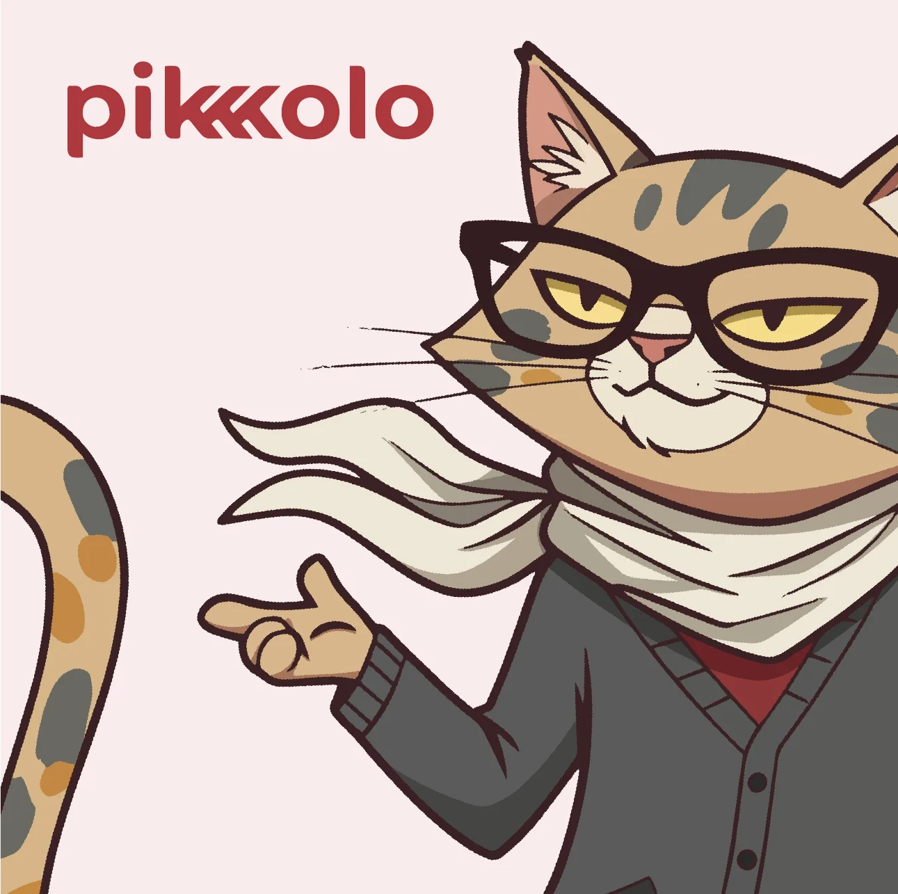
Meet
KhrumKit
From sketch
to cat
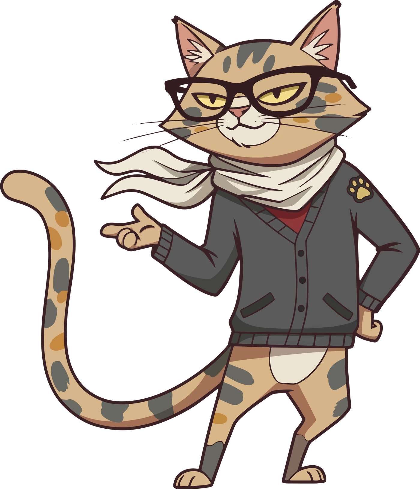
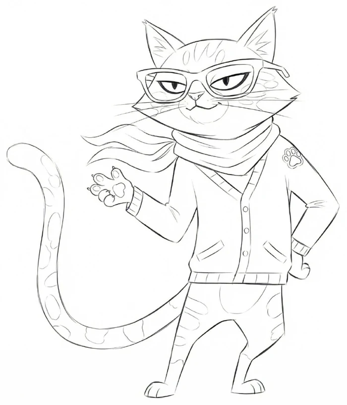
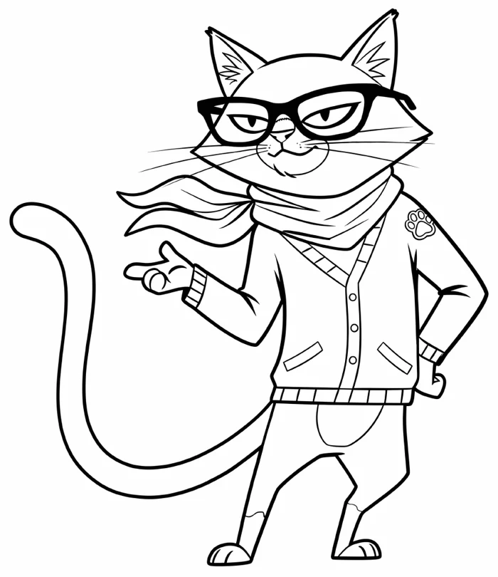
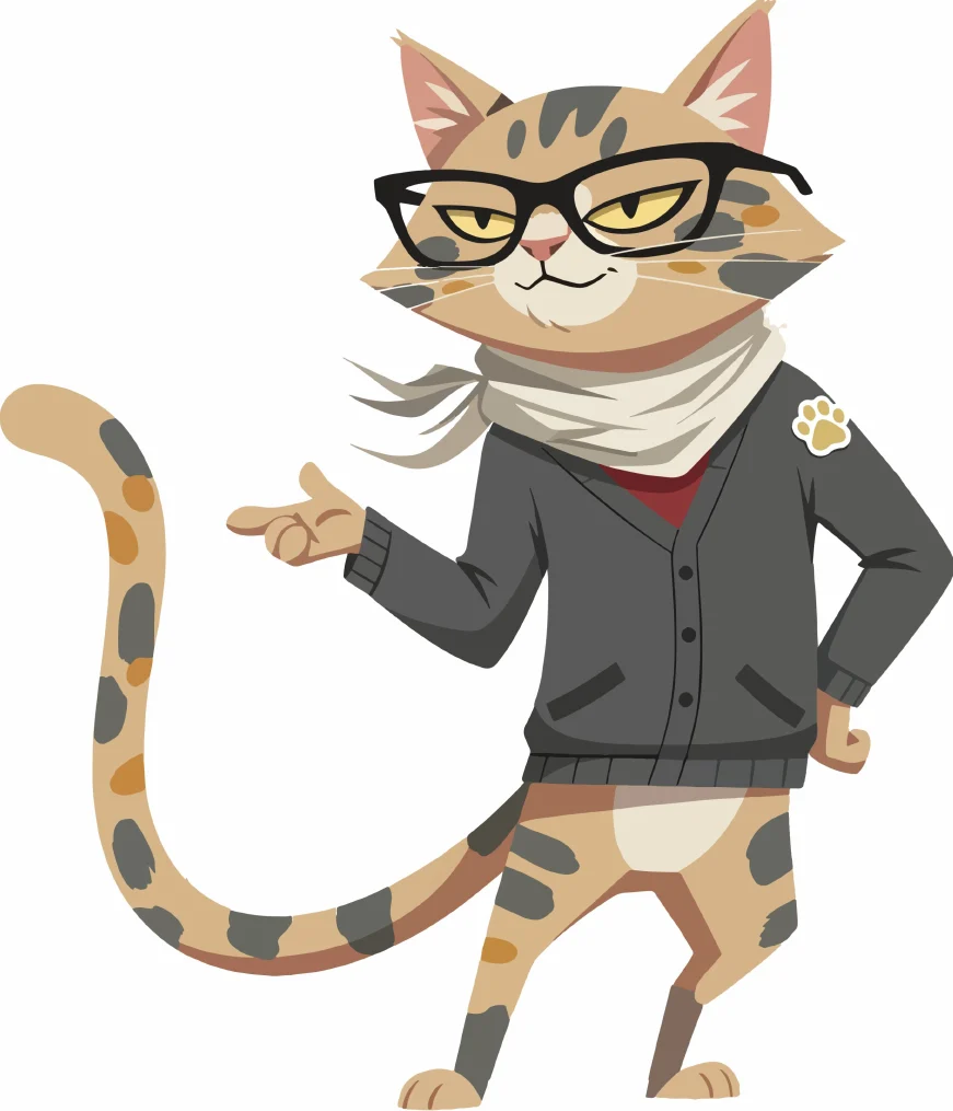
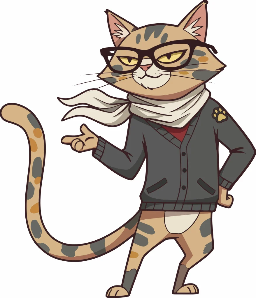
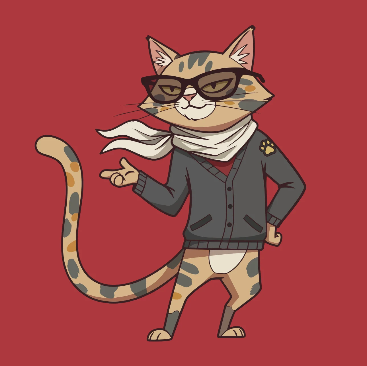
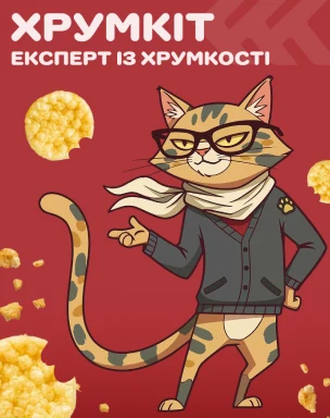
Sketch, clean outline, colour — then the final line-and-colour version. A modern urban cat, not a cute plush toy: lean, active, with a light touch of expertise and irony.
Rules of
the cat
A character only works as a system if anyone can draw him right. So every trait got a rule — what he is, and what he must never become.
Shape
A short-haired city cat, a “street intellectual”. Simple, graphic head between an oval and a soft triangle; the silhouette reads in one colour.
No chubby cheeks, fluffy fur or plush lookEyes
The key element. Big, round or slightly oval — attentive, a bit ironic, playful.
Not too childish, not animeBody
Long, flexible and dynamic, always ready to move — in a jump, in motion, in an action pose. Never static or heavy.
No stiff, standing-still posesCoat
Warm white, light beige and cream, with soft irregular spots in warm graphite and brown-grey — calm and rhythmic, like a design pattern.
No tiger stripes or hard black-and-whiteEmotions
Curiosity, satisfaction, light scepticism, excitement.
No hysterical grins or extra cutenessStyle
2D, flat graphic style, minimal texture and clear outlines — readable even at a very small size.
No realistic “photo cat” detail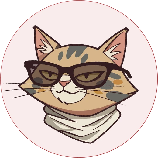
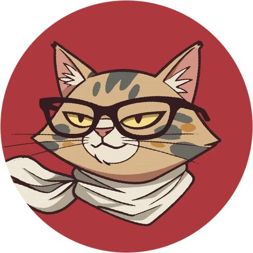
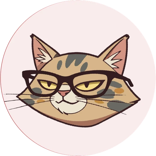
The head as a character icon
One cat,
six modes
Each attribute has its own job, so the team always knows which KhrumKit to use and where. Accessories don’t dress him up — they strengthen his character in a given context.
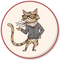
Full body / half body
The hero of key visuals, promo, billboards and city lights, key social posts.
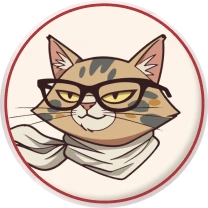
Head icon
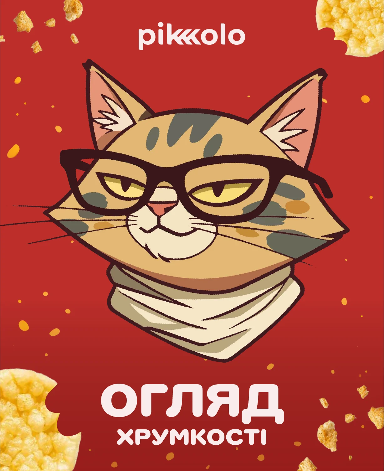
A supporting element: navigation, rubrics like “Crunch review”, reactions, badges and small formats.

Glasses
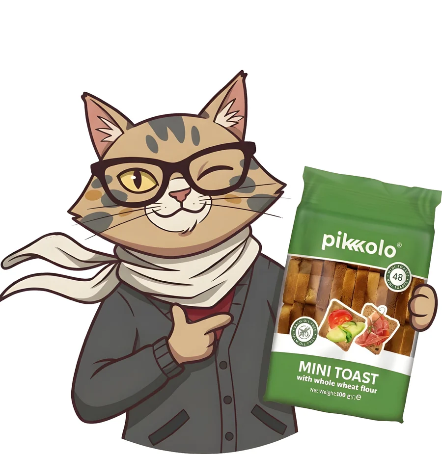
The base state — expertise, reviews, recommendations and explanations.

Sunglasses
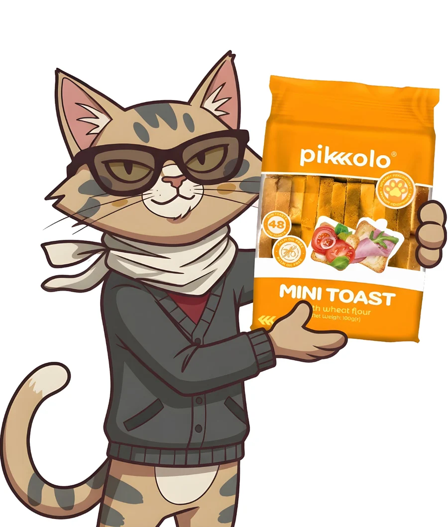
Fun mode — promo, special offers and giveaways.

Scarf & clothes
Seasons, moods and adapting to events.

Seasonal extras
A hat for New Year, a scarf in autumn, light glasses in summer — allowed only if they keep the silhouette and the character.
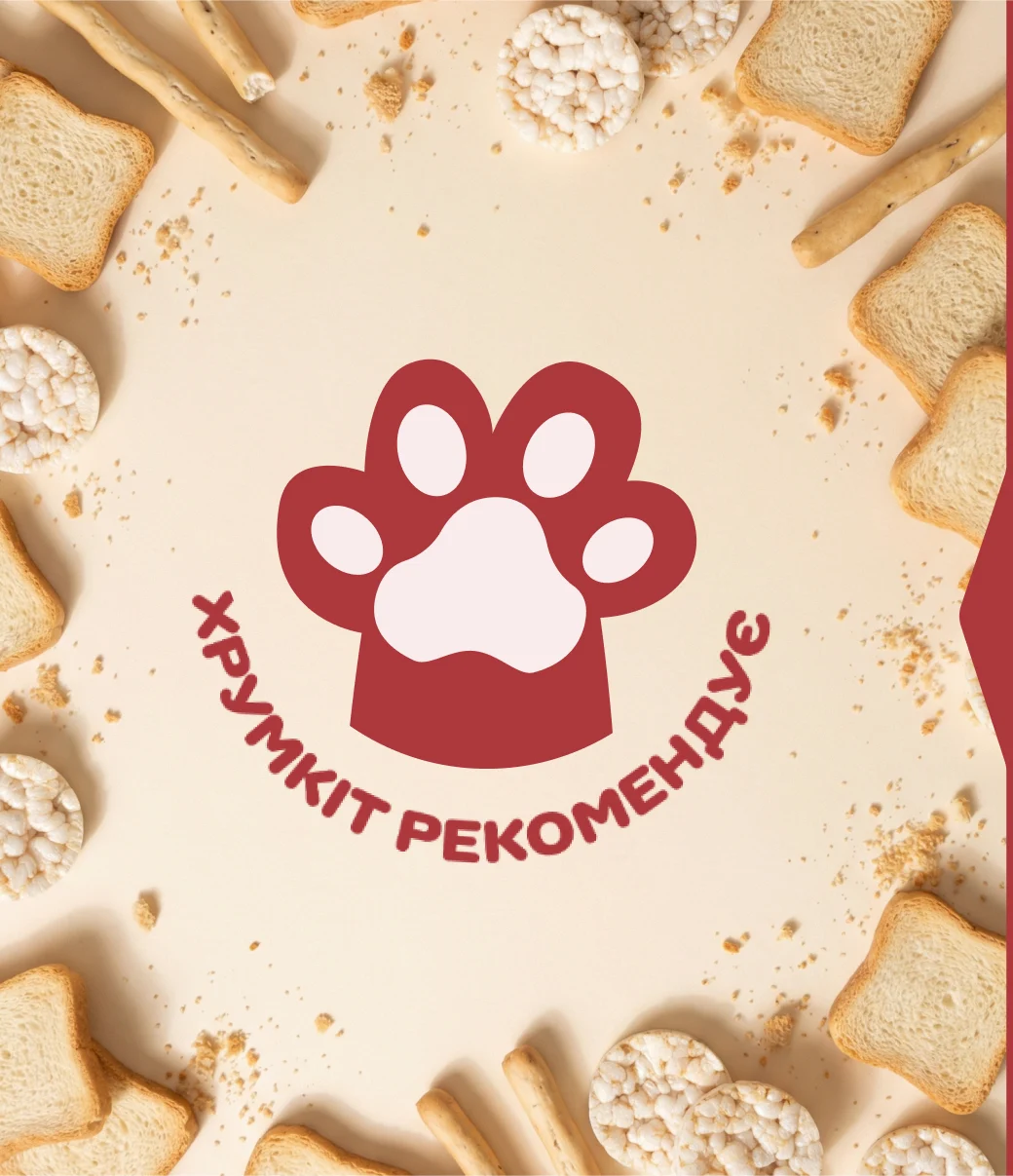
The paw
KhrumKit’s signature: simple enough to be recognized without the cat, used as a sticker, icon or marker. Not a “quality seal” — a sign that KhrumKit is here.
Logo,
colour & type
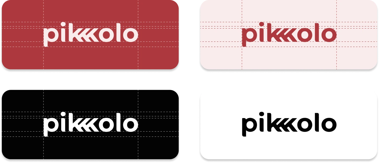
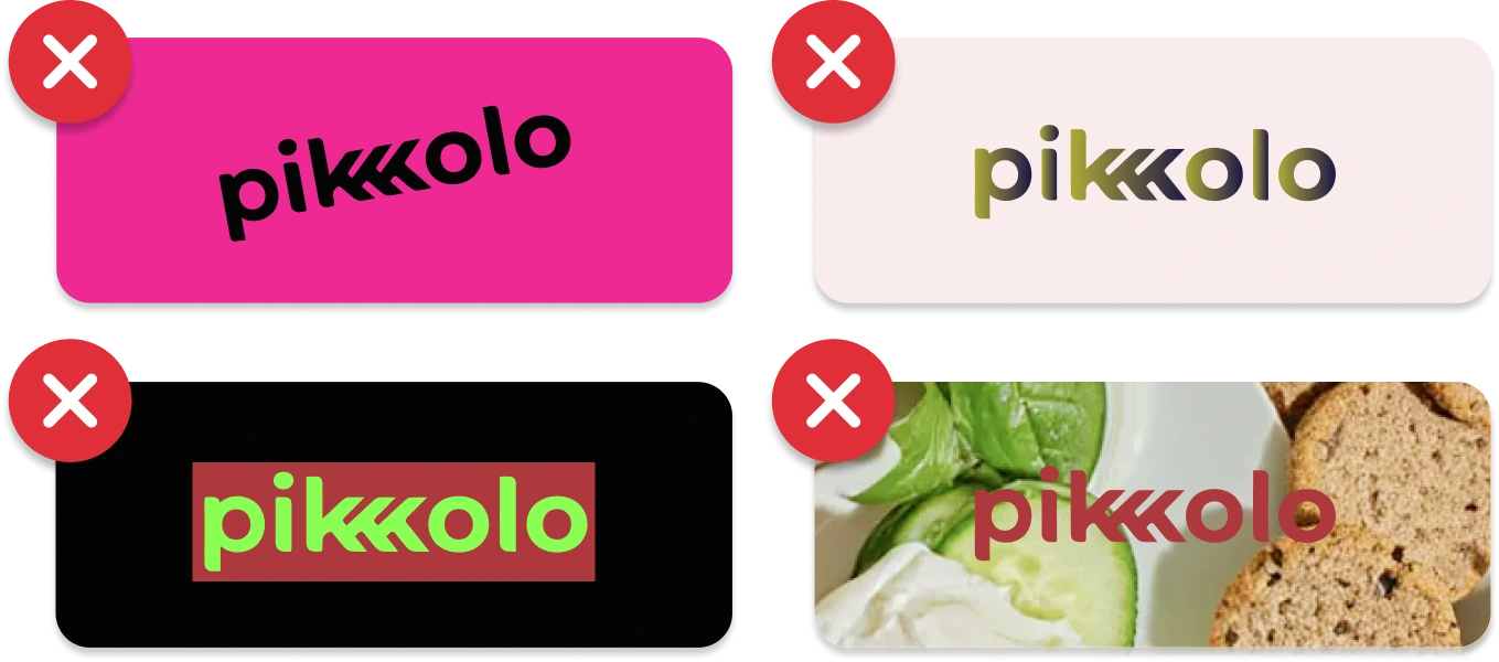
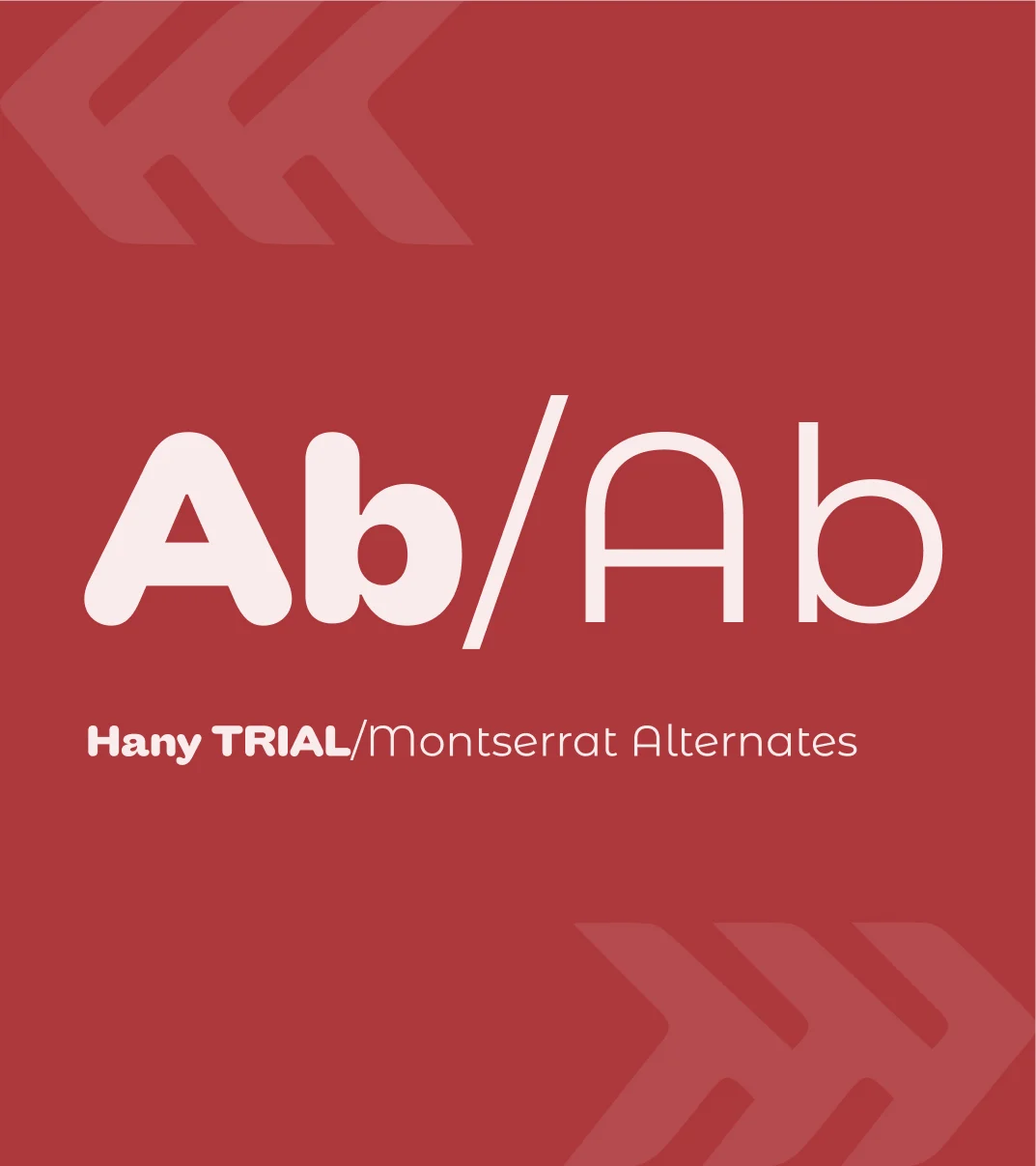
The logo was already well known, so we kept it and set clear rules around it. The palette and fonts came together from the brand’s existing packs — now one system instead of many guesses.
On the shelf
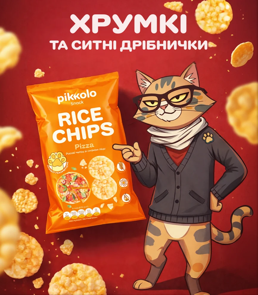
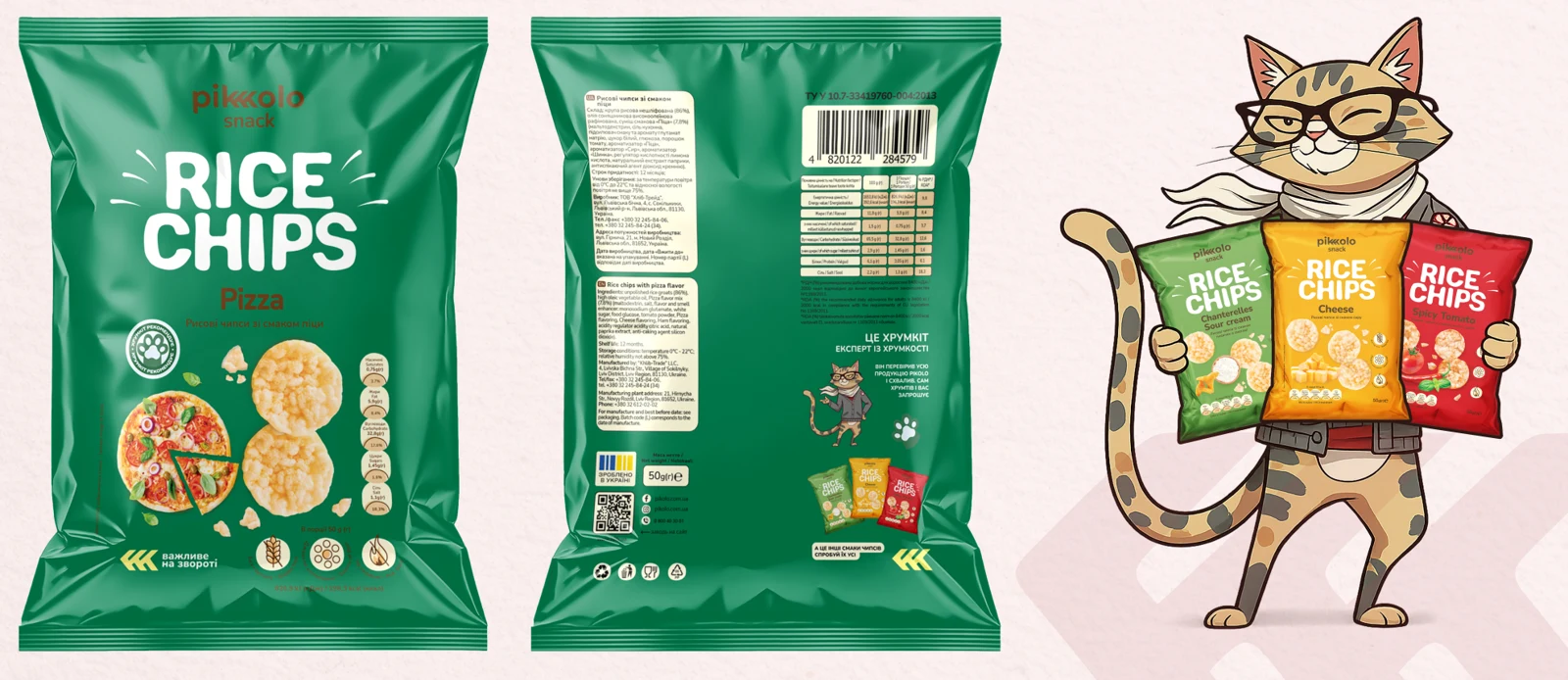
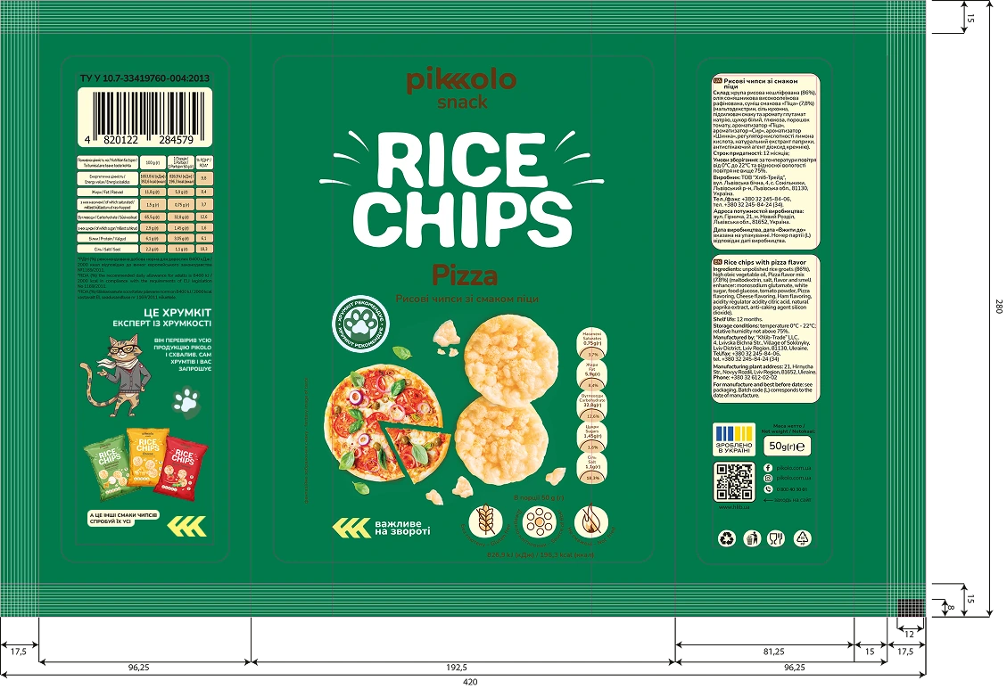
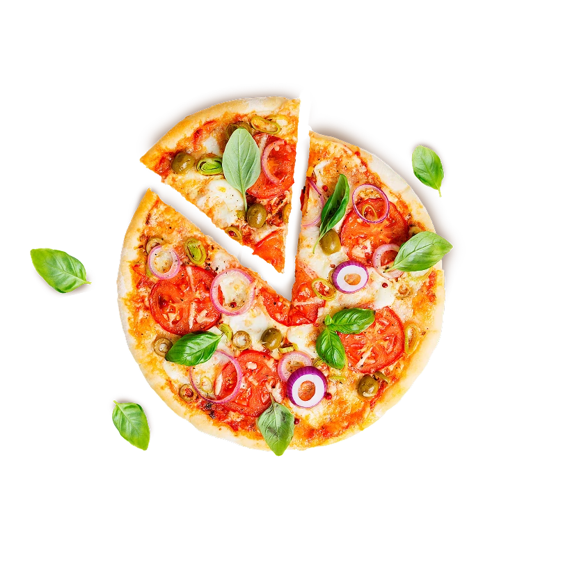
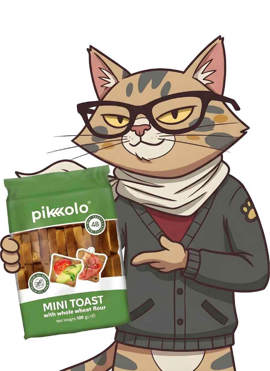
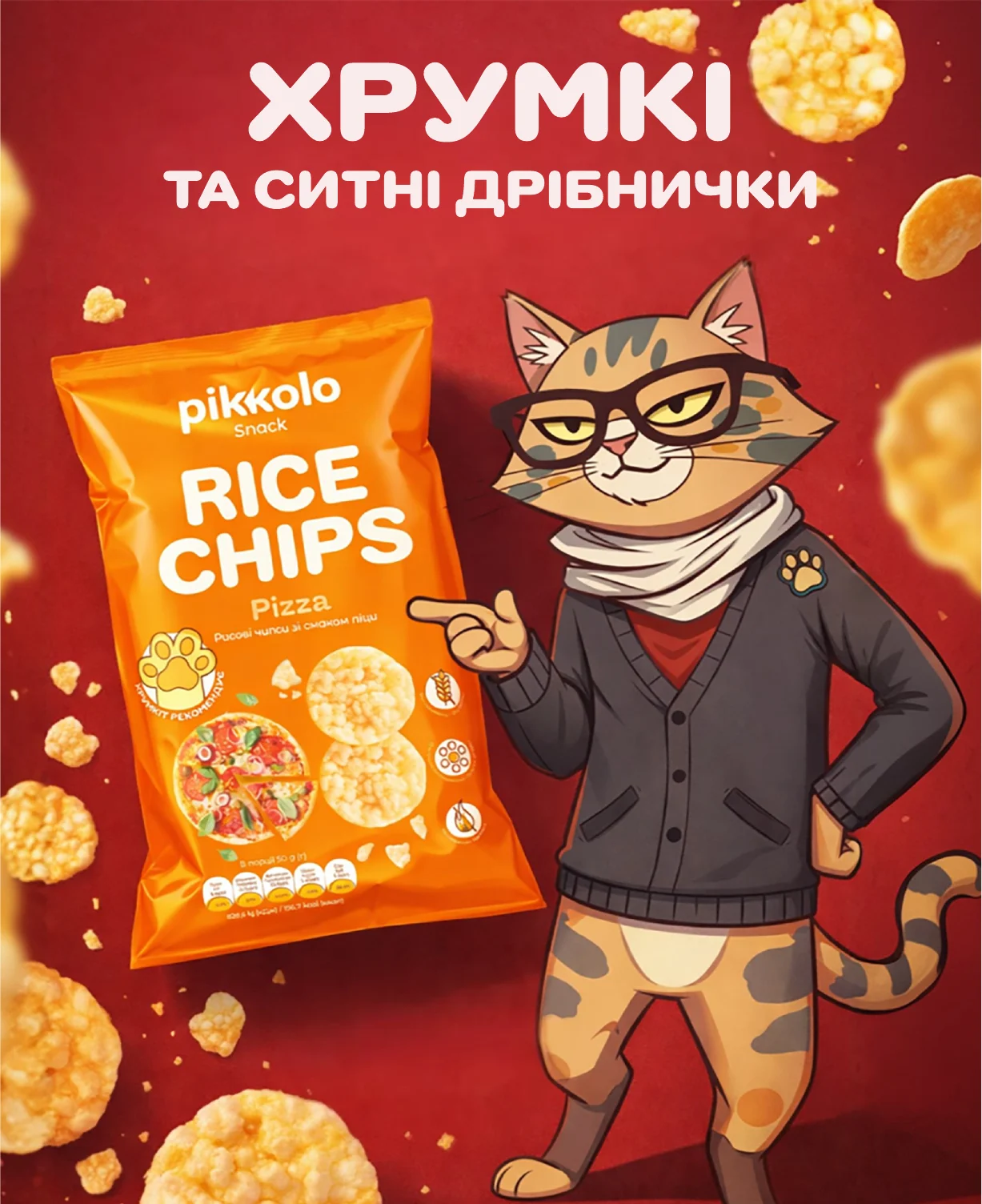
KhrumKit holds the product and points to it — the character works as a living brand interface, right where people choose. Shown: RiceChips Pizza, from dieline to the finished pack.

Feed, street
& merch
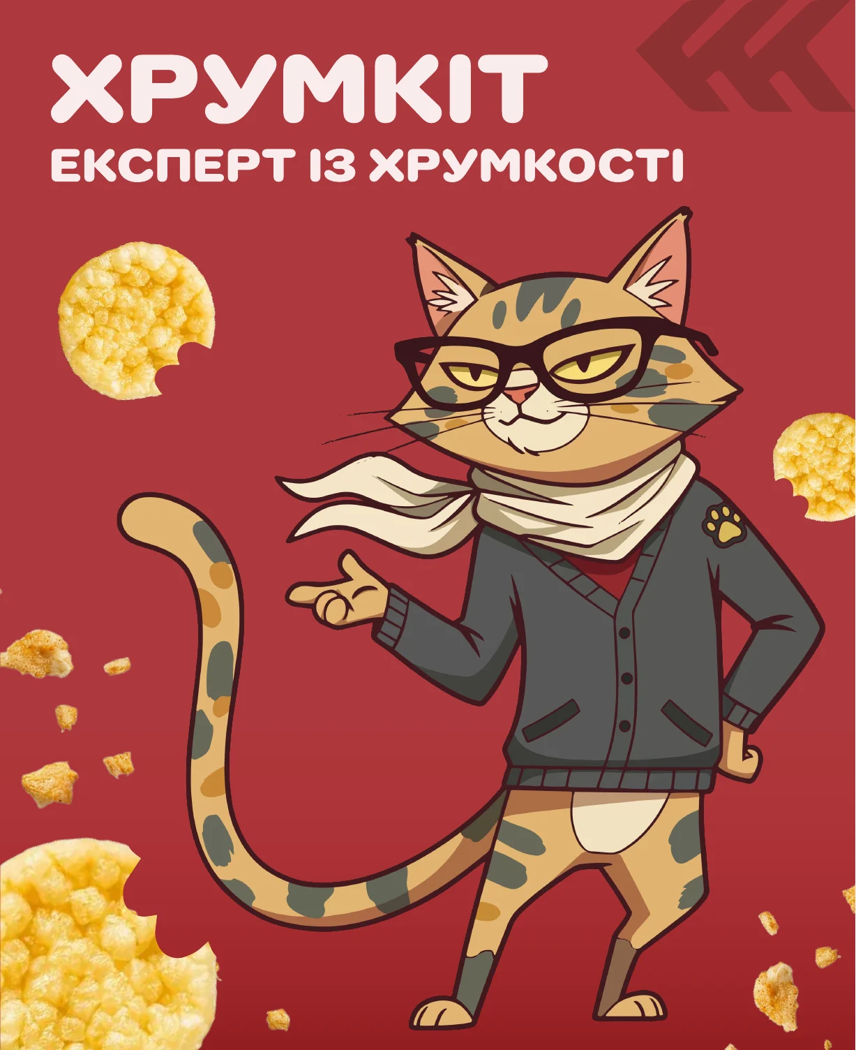
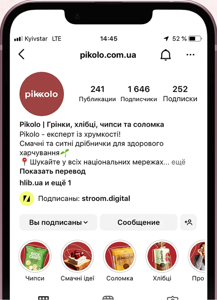
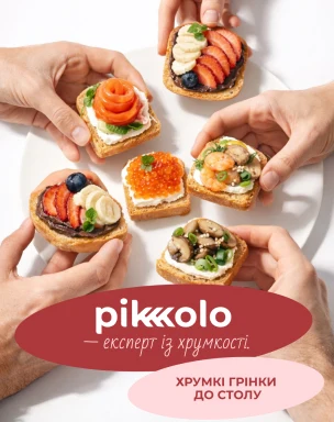
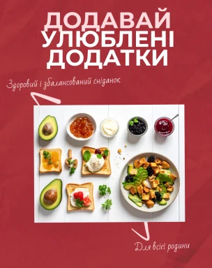
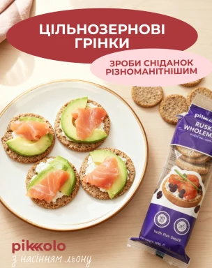
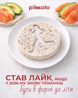
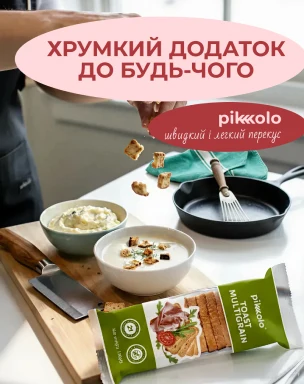
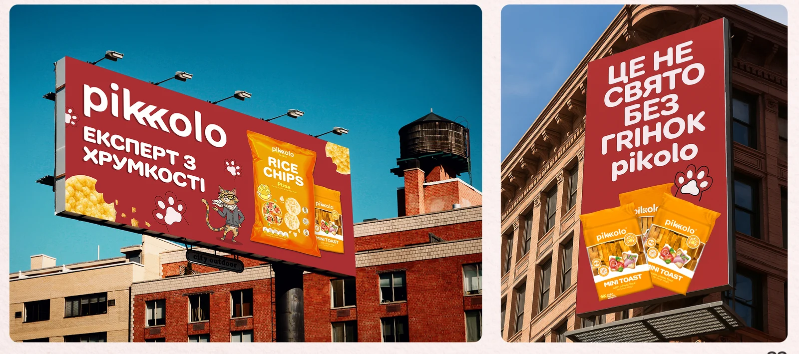
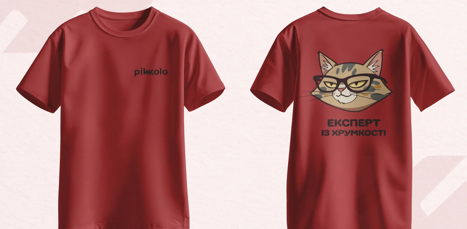
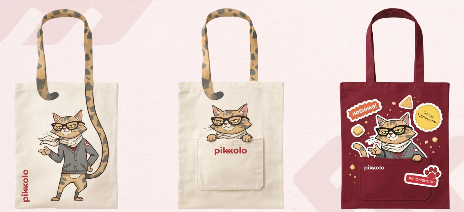
KhrumKit leads the brand on social, joins promo and giveaways, and steps onto billboards as the “Crunch Expert”. The paw and the cat also became prints for tees and tote bags.
A face
for the crunch
Pikolo got its first brand book and a character who connects packaging, social media and outdoor into one recognizable voice.
- Stronger visual consistency across all brand communications.
- Character and identity assets used in marketing and digital campaigns.
- Built with marketing strategists, account managers and the Delivery Director; I also mentored a junior designer on the project.