Case 01 · Rebranding · Healthcare

Lviv Cancer
Center

A visual identity that brings hope and humanity into oncology care — turning a regional medical facility into a symbol of healing and trust.

Client
Lviv Cancer Center
Year
2024–2025
My role
Art Director & Brand Designer — solo, end to end
Scope
Logo, identity system, brand book, social, events, merch
94%patient satisfaction with the new environment
85%reduction in wayfinding inquiries
78%staff approval of the new identity
01 — Overview

The brief

The Lviv Cancer Center is one of the region’s leading oncology institutions. The goal was a modern, empathetic brand that reflects trust, innovation and care.

Inspired by renewal and nature, the identity is built around a Tree of Life mark and a calm emerald palette. The new design helps reduce patient anxiety and positions the center as a progressive, human-focused institution.

Full brand book available on request — let’s talk

Lviv Cancer Center logo on a frosted panel next to a doctor in emerald scrubs
02 — Logo concept

A tree
of life

A minimalist Tree of Life with five leaves, held inside a calm emerald circle — a symbol of hope, renewal and resilience.

Lviv Cancer Center logo: a white tree with five leaves inside an emerald circle
01

Emerald green

Life, balance and harmony — reinforcing the center’s mission of holistic patient care.

02

Tree of Life

Growth and renewal, conveying optimism to people going through treatment.

03

Five leaves

Strength, endurance and hope — a progressive approach to oncology care.
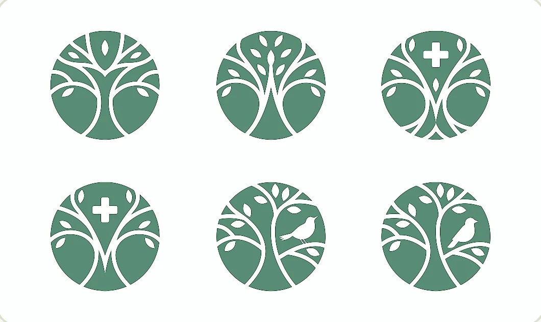
Sketches
Six logo sketches exploring tree shapes inside a circle
Icon & wordmark
Final logo lockup: tree icon with the Lviv Cancer Center wordmark
03 — Identity system

Colour, type
& pattern

A calm, nature-led palette, two clear typefaces and a leaf pattern that scales from a business card to a brand wall.

Primary#177A5B
Additional#298365
Additional#DFE0CE
Additional#282828
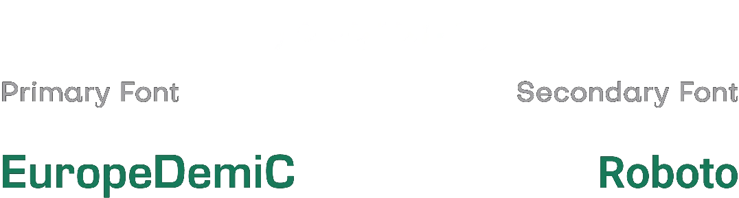
Typography · EuropeDemiC (primary) & Roboto (secondary) Type specimen: EuropeDemiC as the primary font and Roboto as the secondary font
Main emerald leaf pattern
Leaf pattern on a light sage background
Leaf pattern on a dark graphite background
04 — Brand in use

From desk
to ward

Stationery, uniforms, signage and everyday objects — one consistent, calm language across every touchpoint.
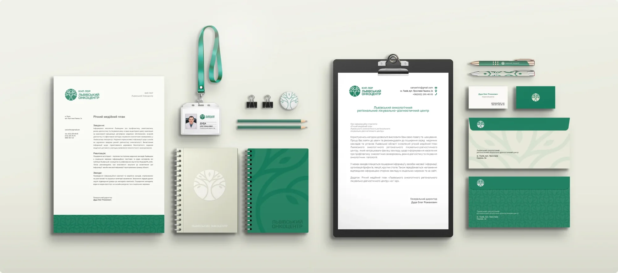
Stationery set: letterhead, badge, notebooks, clipboard, pens and business cards
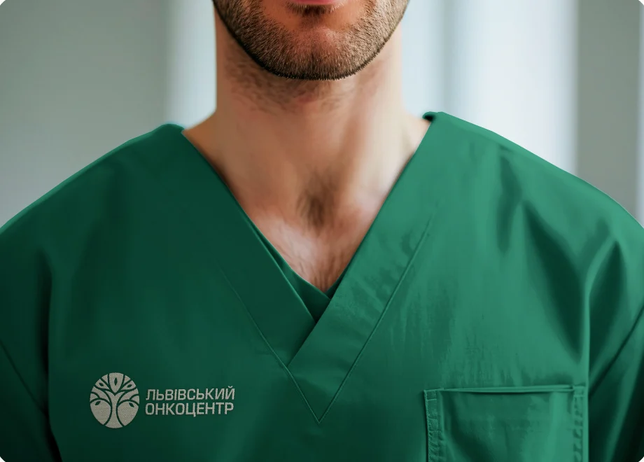
Doctor in emerald scrubs with the embroidered logo
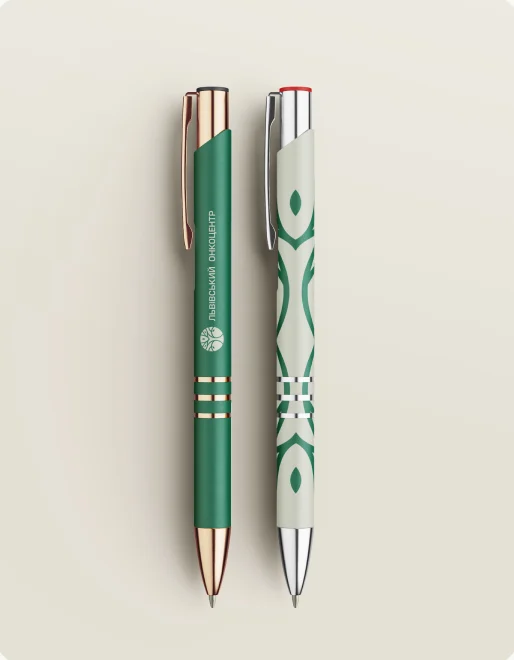
Branded emerald and white pens
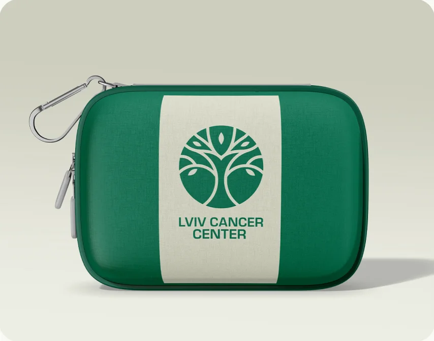
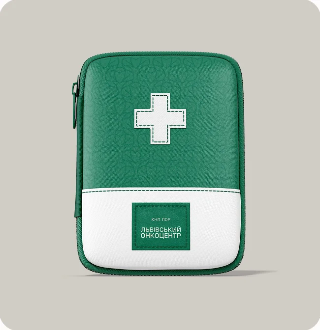
Emerald first-aid kit with the Lviv Cancer Center logo
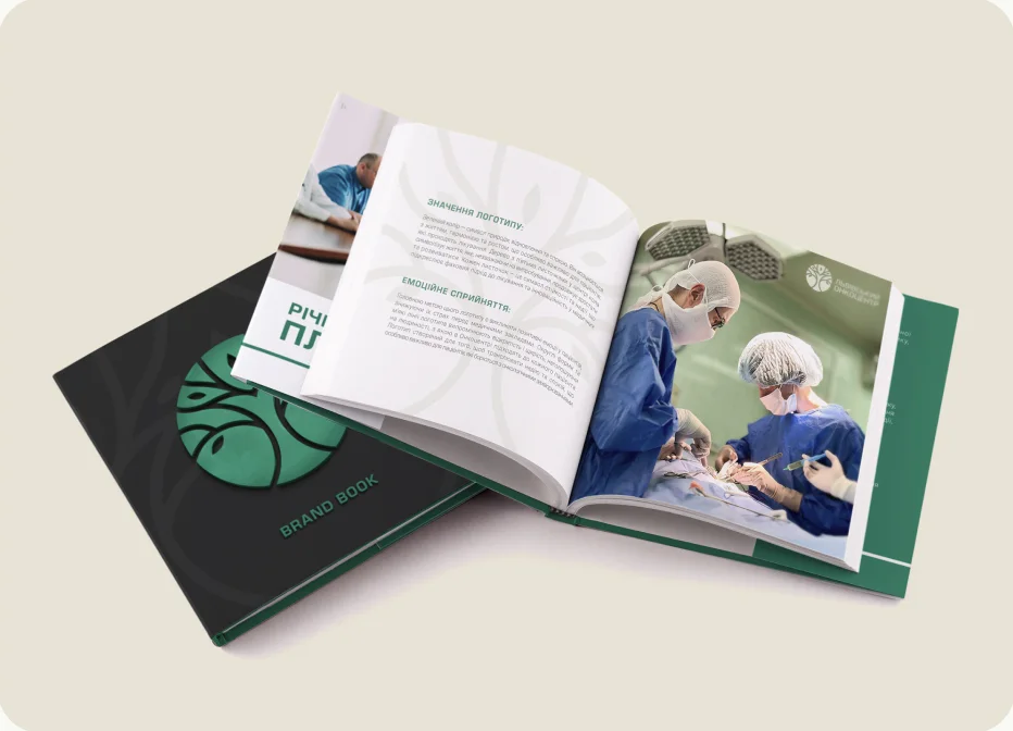
Open brand book showing layouts with photography

The brand book

Created to capture the essence and values of the center, it is the foundation of the visual identity and a reference for everyone who works with the brand — so every touchpoint stays modern, open, clear and consistent.
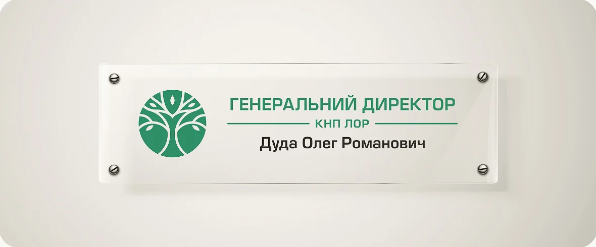
Glass door sign for the director’s office with the logo
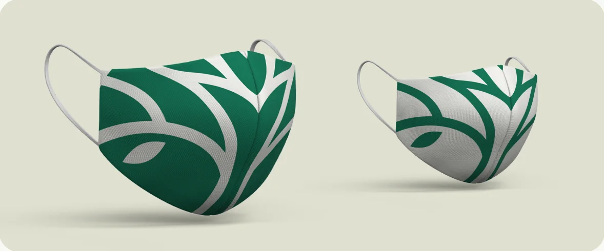
Two face masks with the leaf pattern
05 — Social media

A calm
feed

The new identity builds trust and calm online too: it reduces patient anxiety and reinforces the image of a supportive, innovative and humane institution.
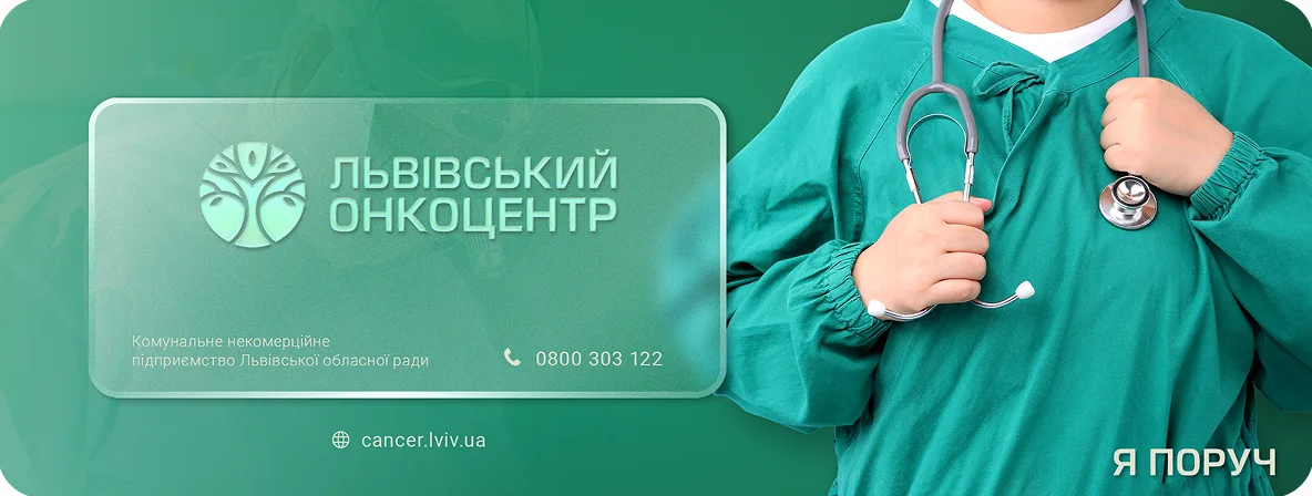
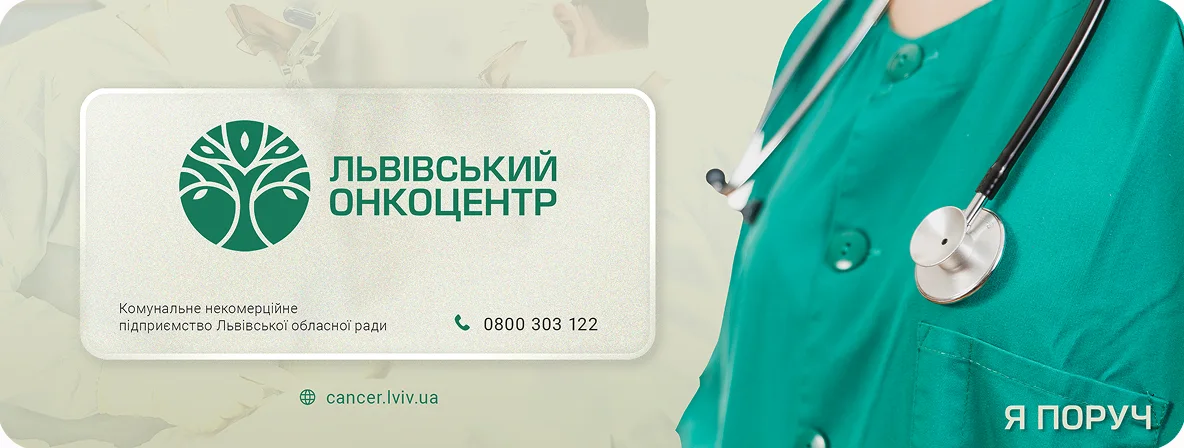
Facebook covers · two options
Facebook cover, option 1: emerald background with a doctor and frosted logo panel
Facebook cover, option 2: light sage background with a doctor and frosted logo panel
In context
Laptop showing the Facebook page with the new cover
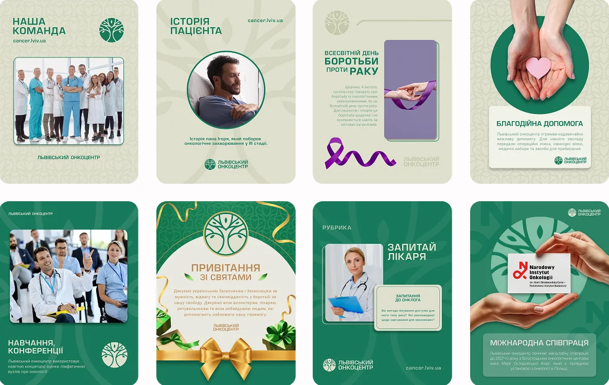
Instagram post templates
Eight Instagram post templates: team, patient stories, doctor Q&A, holidays and more
Highlight icons
Nine circular Instagram highlight icons in emerald
06 — Events & promo

On stage

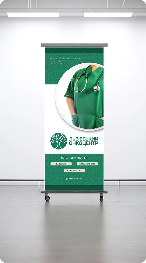
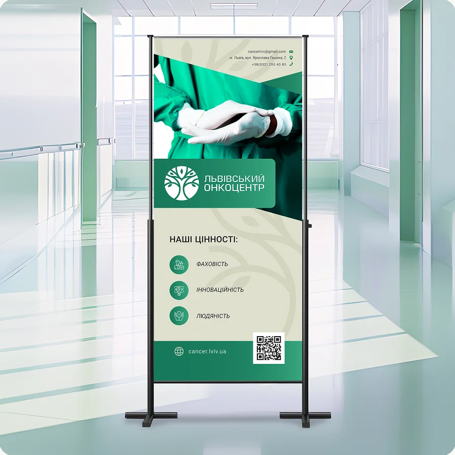
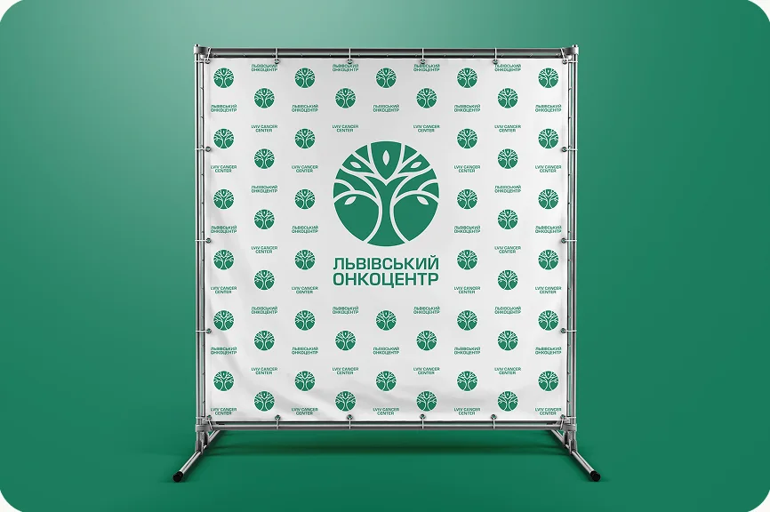
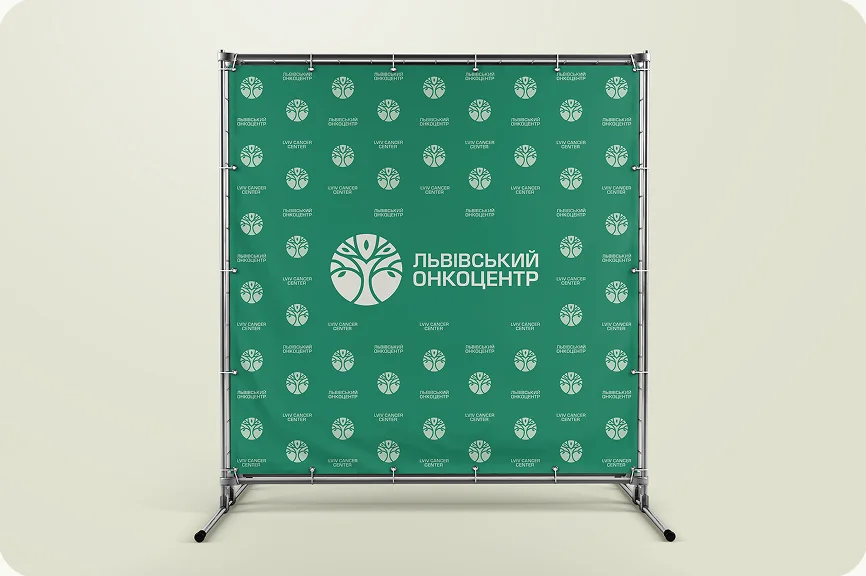
Roll-up banners for conferences and press walls for public events — the leaf pattern and the tree mark carry the brand at any scale.
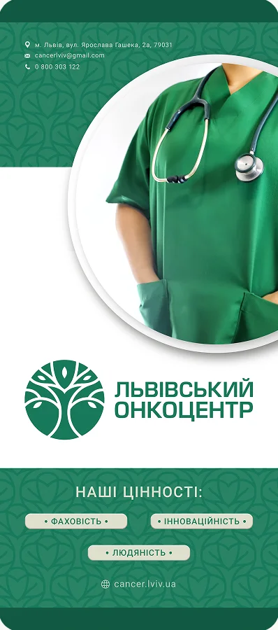
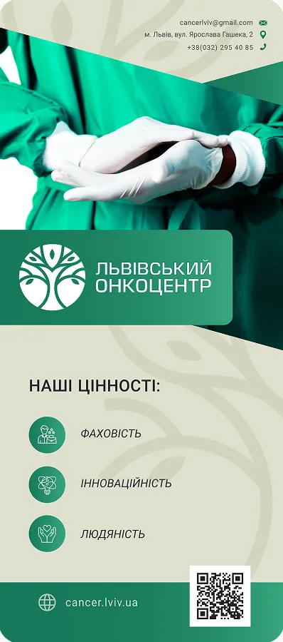
Conference roll-up banner with a doctor
Conference roll-up banner listing the center’s values
Roll-up banner standing in a bright hall
Roll-up banner standing in a hospital corridor
Brand walls
White press wall with a repeating logo pattern
Emerald press wall with a repeating logo pattern
07 — Merch & uniforms

“I’m here
for you”

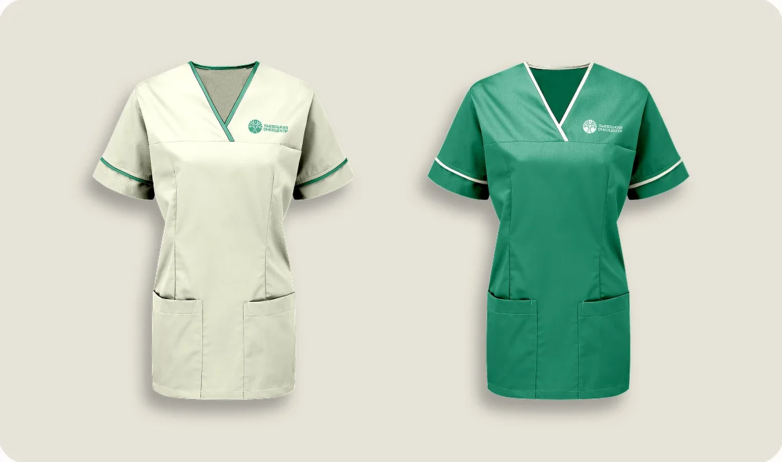
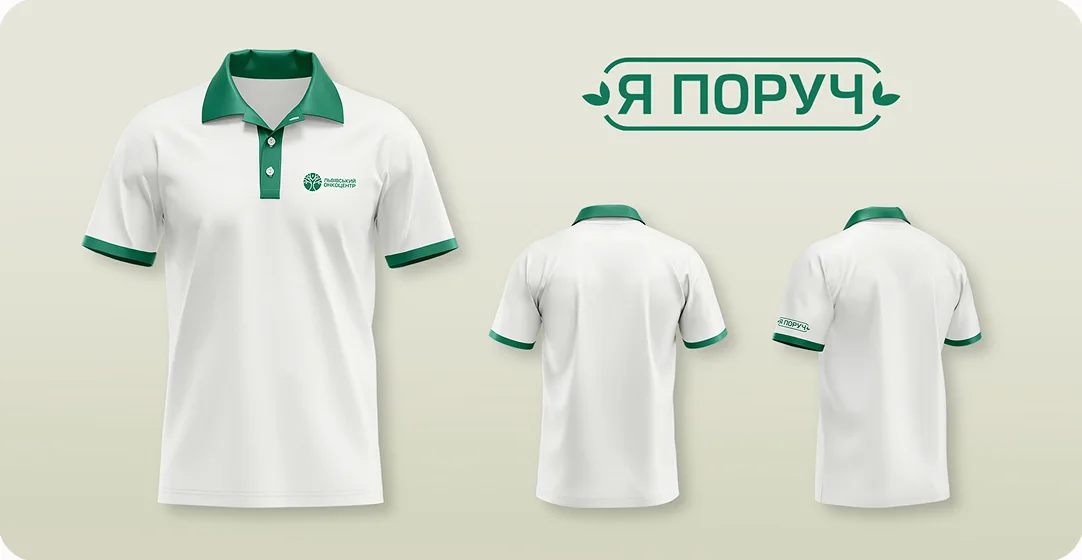
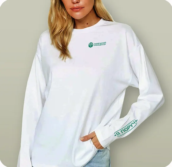
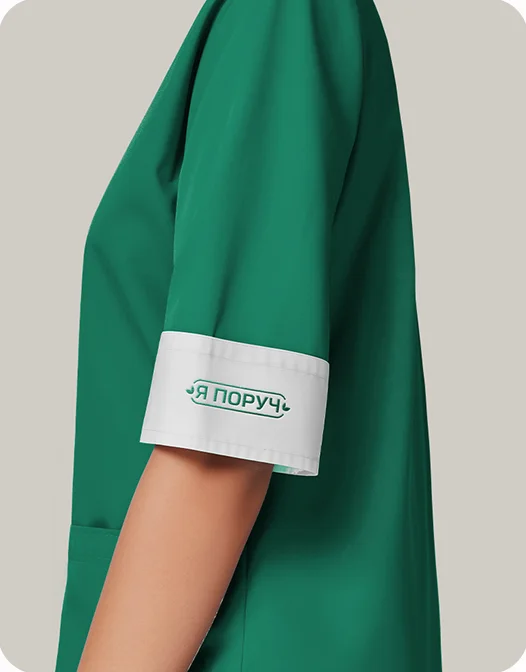
Merchandise and staff uniforms, including the “Я поруч” (“I’m here for you”) line — small details that make care feel personal.
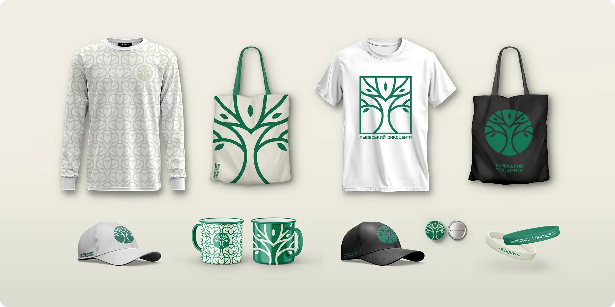
Merchandise set: sweatshirt, tote bags, T-shirts, caps, mugs and wristband
Sleeve patch reading Я поруч
Two medical uniforms, light and emerald
Emerald and white first-aid kit
Branded polo shirts with the Я поруч badge
Woman in a white branded sweatshirt
Embroidered logo on a white doctor’s coat
08 — Impact & results

From clinic
to care

The new branding transforms how the center is perceived — from a clinical facility to a trustworthy, supportive medical space.

  • Increases patient confidence with a welcoming, modern image.
  • Reduces anxiety around treatment with a soothing, nature-inspired aesthetic.
  • Strengthens recognition, positioning the center as a progressive leader in oncology care.
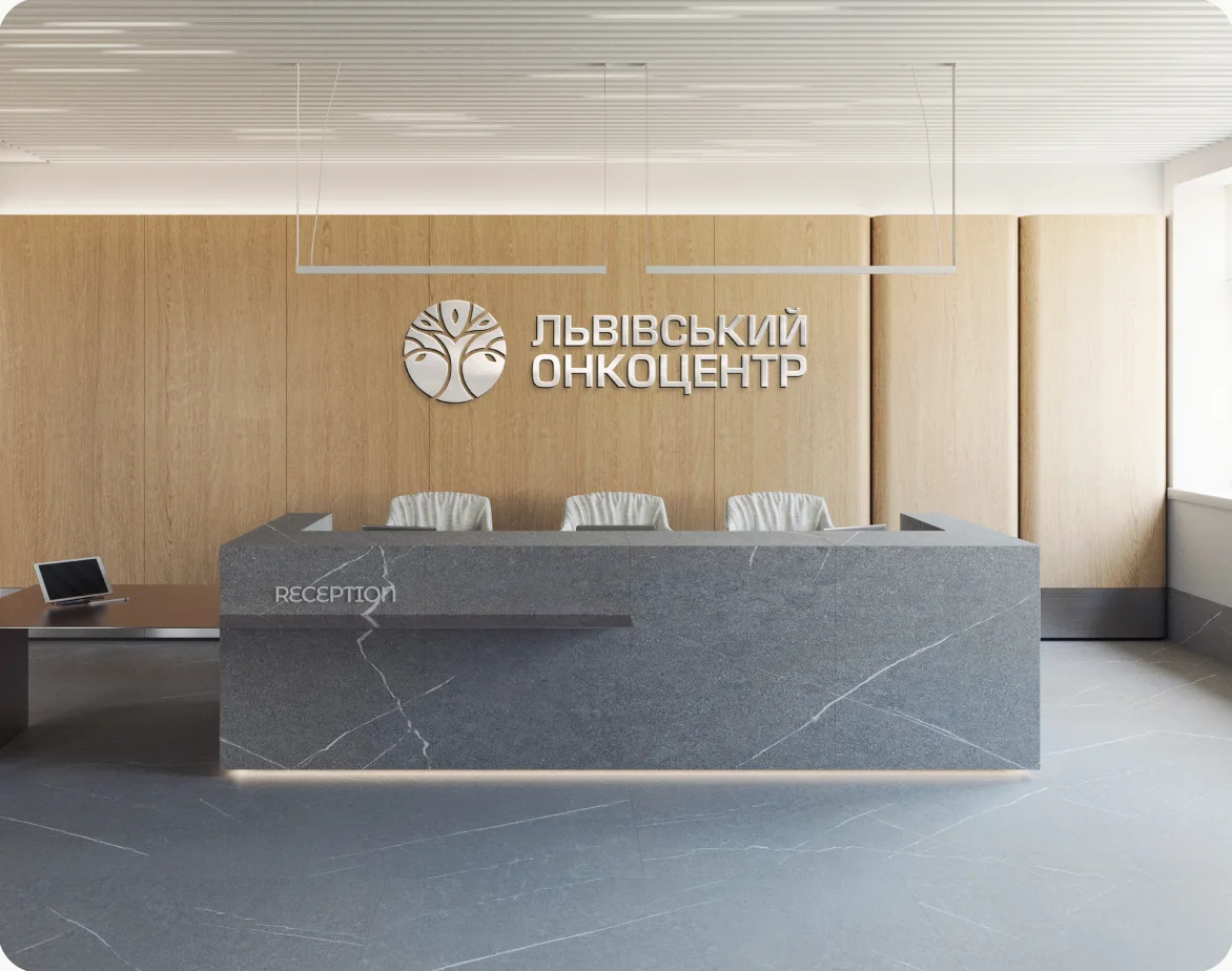
Reception desk with the illuminated Lviv Cancer Center logo on a wooden wall
94%Patient satisfaction with the new environment
85%Reduction in wayfinding inquiries
78%Staff approval of the new identity

Measured after the rollout · data from the client’s marketing & PR team

Who’s behind the workMore about me